Wrench Force
- Client NameTrek Bicycle
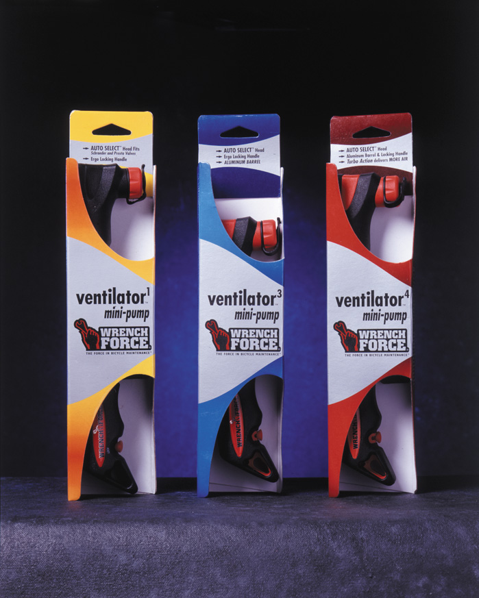
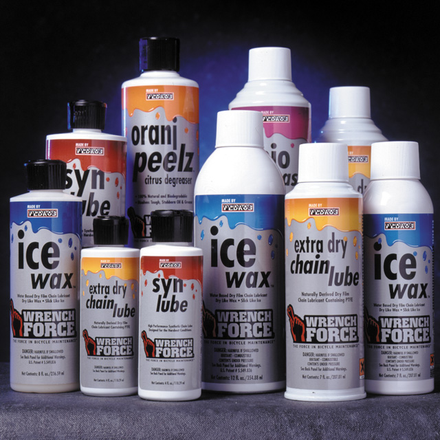
Wrench Force underwent a rebrand to make it more accessible to consumers and help it have greater shelf presence. Previously it had black packaging, silver type and the red on the logo. By focusing on the various product categories and incorporating the physical attributes of the products into the visual language, we created distinguishing packaging. The color coding helped to differentiate the variety of product options at the shelf.