Icon
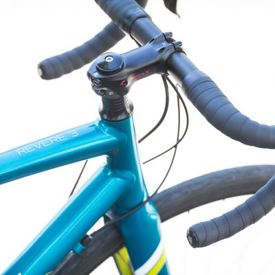
- Client NameTrek Bicycle
The redesign of the Icon brand packaging system. The brand was known for quality and precision based after-market bike components. The redesign of the packaging needed to have distinctive presence on the shelf and offer a quick read for people looking at specific sized items. The concept behind the final design incorporates memorable shapes and easily readable numbers for consumers to quickly find the products they want. The curves help accentuate the clean lines of the product and the thick fluted corrugated cardboard helps protect it.